Apple
iOS 26 creates readability concerns due to over transparent design

Apple has released iOS 26 with a liquid glass design, the biggest redesign in the history of iOS, but early users have shared their concerns about the reduced readability.
The new liquid glass design is heavily inspired by the visionOS, a software designed for Apple’s AR/VR Vision Pro headset. Unlike this device, the company has made some new changes in the appearance, for example, adding new animations and making the background simply transparent.
Users reached the social media site to share their feedback on this new design language, calling it highly unreadable. The majority of these users voiced concerns about the over-transparency between the UI element and the background.
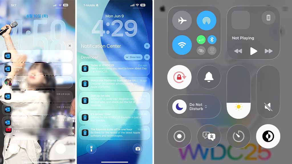
In scenarios such as reading the text or seeing a button icon, it has become hard due to the loss of visibility. Tasks, including control center expansion, show this scenario with full effect, where its background layer and control switches are transparent enough to allow the home screen content to peek all the way to the front.
Unlike iOS 26, iOS 18 has managed things pretty well, and you can easily notice the difference between the two design systems, at least in the matter of readability.
It’s kinda messy huh?🤔 pic.twitter.com/uhqAVM7avi
— Beta Profiles (@BetaProfiles) June 9, 2025
Another instance is the lock screen, where the notification will have unreadable text due to the transparent background shape, which can no longer support the visibility of the foreground text/content, and everything appears blurred.

Besides, Apple has added some amazing animations and transitions throughout the software, but the developers need to listen to user feedback on the readability concerns about the new iOS 26 design.

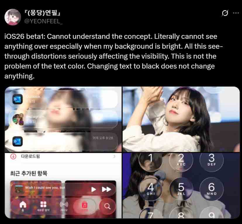
Source – YEONFEEL_/X

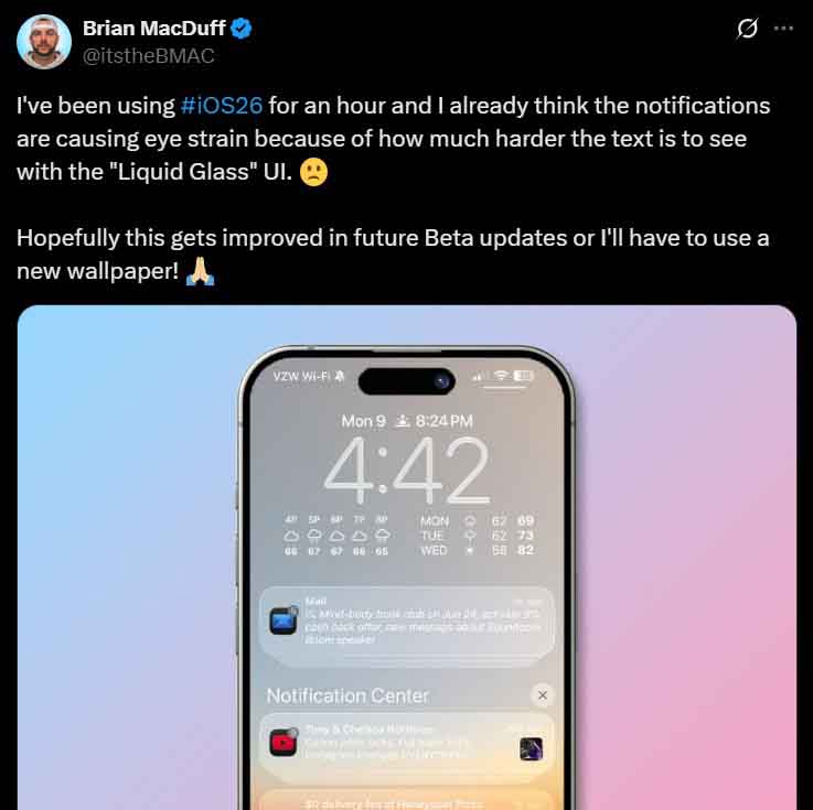
Source – itstheBMAC/X
For now, iOS 26 is being tested under developer beta, and it will take 2-3 months before final rollout. So, it is a good timeline to make changes in the software design to make it readable.