SpaceX
SpaceX now has an interactive website design with a futuristic launch counter

SpaceX has pushed a new design update to its website, bringing a more informative look to the visitors, especially on the launch schedule page, where it has simplified various details.
One of the most notable changes is the new font family, these are more angular and looks better than the predecessor. The home page has shortcuts for the SpaceX profile, including the mission to Mars.
Coming to the launch page, which has received extra attention, now includes a reverse timer for the next mission featured on top, with a redirect link to the dedicated page. The company is now showing counters for Completed Missions, Total Landings, and Total Reflights below the featured missions.
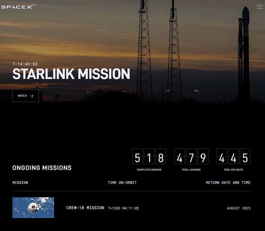

However, this next part has intrigued me the most. The company is showing ongoing missions, with specific details and a table of details such as mission name, vehicle used for the mission, launch site, landing site, and launch time.
The nearest launch will be promoted on top with a reverse countdown. Another major change in the site has appeared as a local time zone; it will detect your local time zone and show the launch window with your localized clock.
The upcoming section will show up to 6 mission details, and the completed missions will add a pagination system for you to explore. You can also search for any mission with a search bar or sort each column.
The bottom of the page consists of details about SpaceX’s launch sites. This is a cool design upgrade for the SpaceX website and one of the easiest to navigate you want to know more about the upcoming mission schedule.